인사이더 스토리 – 신규 CI

Korean air

Period
2025
Format
다큐멘터리 시리즈
Location
서울, 홍콩

Overview

대한항공의 리브랜딩 다큐멘터리 시리즈의 첫번째 에피소드로, 대한항공 임직원과 파트너사와의 인터뷰를 통해 새로운 CI에 담긴 대한항공의 비전과 철학을 전하는 영상

Thematic

브랜드 비전 확립

What We Did

다큐멘터리 기획 제작, 해외 촬영, 포스트프로덕션

Watch

Context

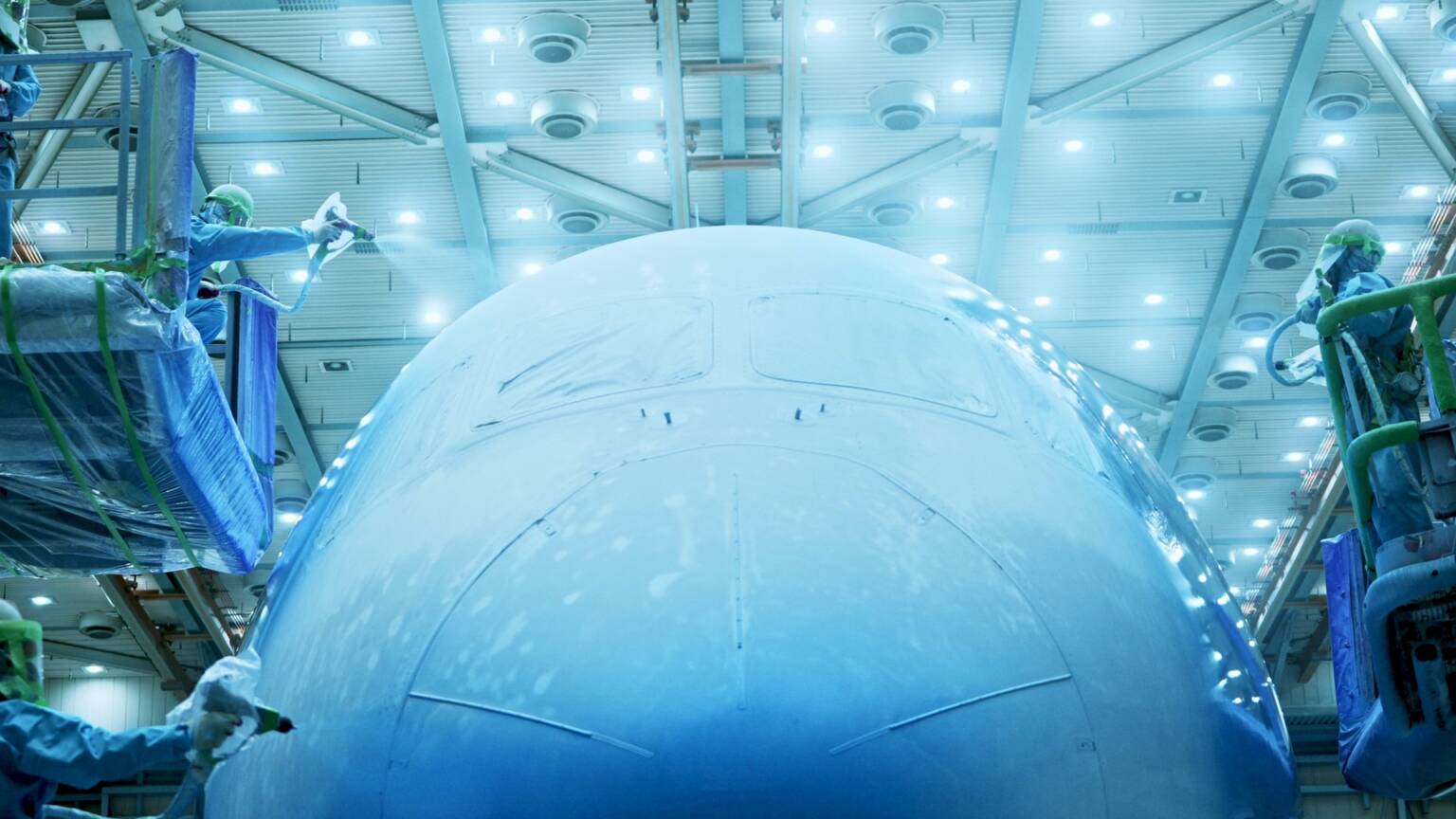
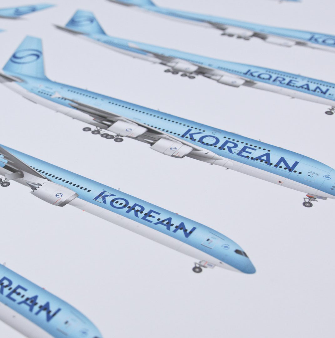
대한항공이 41년 만에 새로운 CI를 공개했다. 1984년 이후 처음으로 바뀐 이번 로고는 단순한 시각적 변화가 아니라, 아시아나항공과의 통합을 앞두고 글로벌 프리미엄 항공사로 도약하겠다는 선언이었다. 이번 프로젝트는 글로벌 크리에이티브 컨설팅 회사인 리핀코트과 협업해 진행했으며, 전통적인 태극 문양을 현대적인 감각으로 재해석하면서도 한국적 정체성을 존중하는 방향으로 설계했다. 상모놀이의 유려한 리본 움직임에서 영감을 받은 새로운 태극 디자인과 한글 붓글씨의 흐름을 현대적으로 풀어낸 타이포그래피는 전통과 현대를 잇기 위한 대한항공의 고민을 담았다. 대한항공은 변화의 중심에 있었던 이들의 목소리를 통해 이 전환의 순간을 진정성 있게 전달하고자 했다.

Challenge

우리는 촉박한 제작 일정 속에서 서울과 홍콩을 오가며 인터뷰를 진행했다. 새로운 CI는 대한항공 내부에서도 최고 수준의 기밀로 관리된 프로젝트였기 때문에, 보안을 지키면서도 효과적으로 이야기를 전달하는 균형이 필요했다. 리핀코트의 크리에이티브 디렉터가 디자인 철학을 소개하고, 경영진이 전략을 공유하며, 실무진이 현장에서 변화를 적용하는 과정에 대해 설명하는 등 다양한 관점을 하나의 흐름으로 엮는 것이 핵심 과제였다. 41년간 이어온 브랜드 유산에 대한 존중과 앞으로의 변화에 대한 기대감을 함께 담아, 국내외 시청자 모두에게 울림 있는 메시지를 전하고자 했다.

Solution

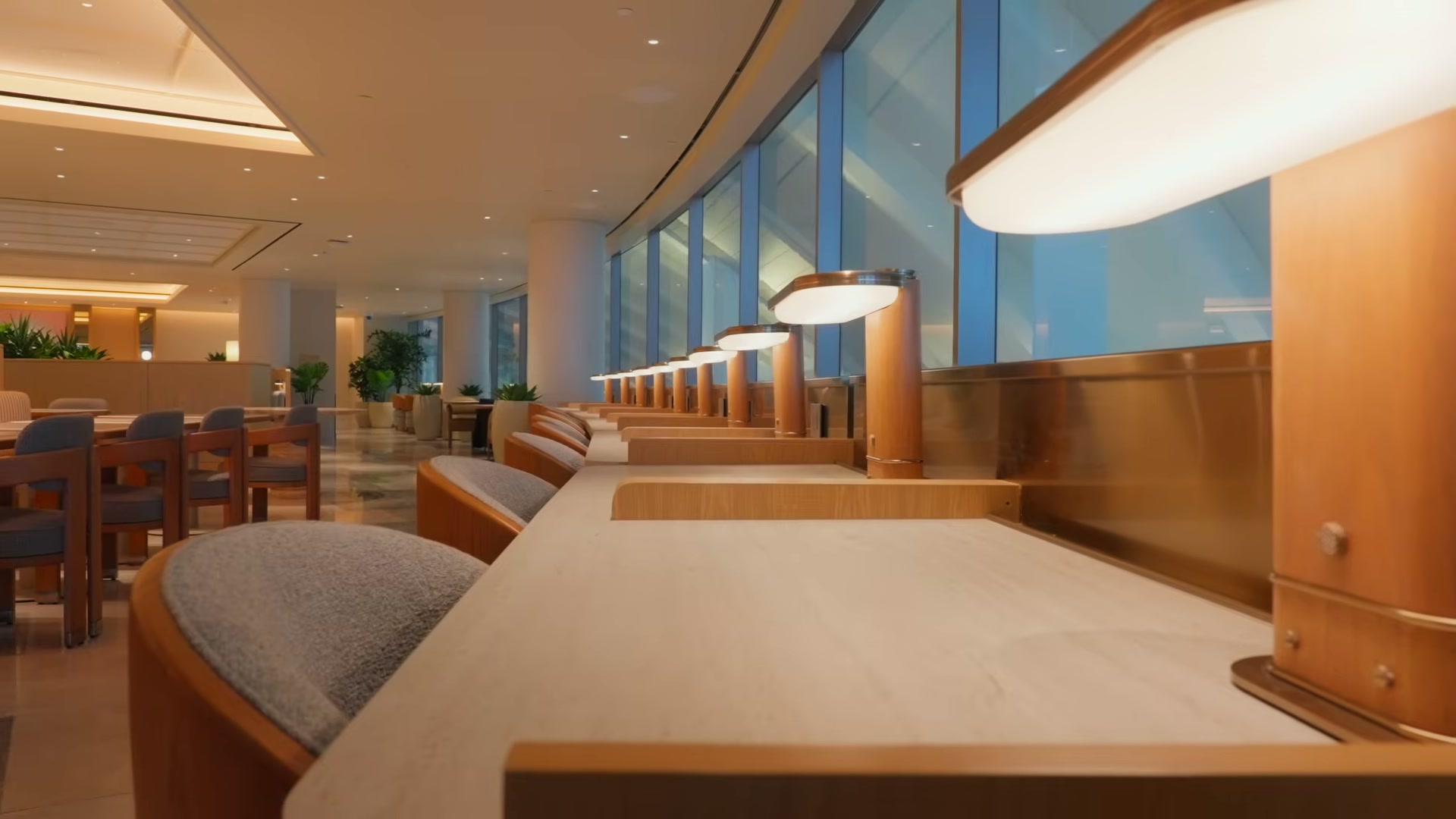
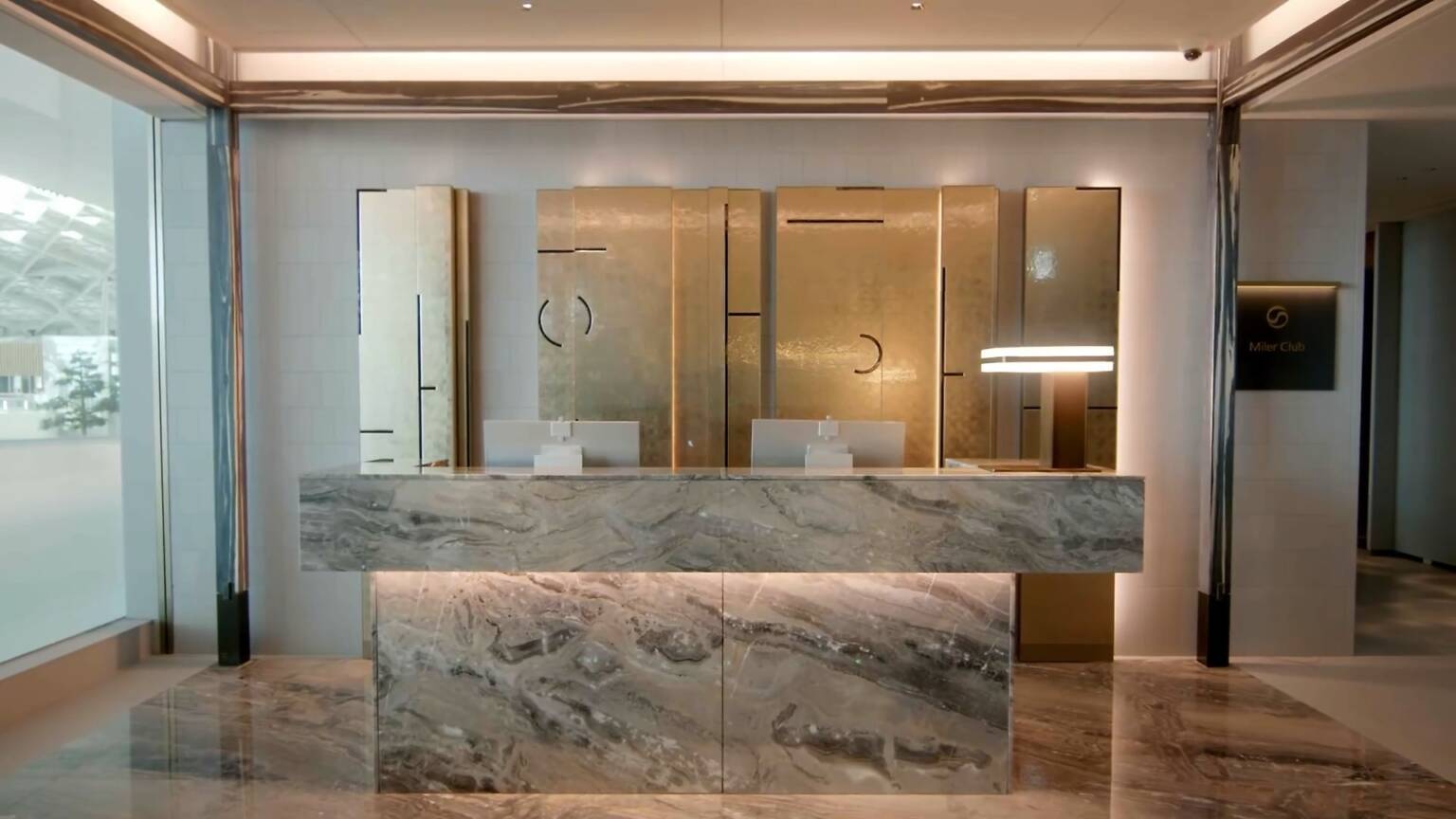
대한항공의 CI는 오랜 시간 많은 이들에게 사랑받으며 고객들의 기억 속에 깊이 각인되어 있었기 때문에, 이를 교체하는 이유를 충분히 납득시킬 필요가 있다고 보았다. 과거의 역사 위에 앞으로 나아가고자 하는 방향을 명확히 제시하는 것이 중요했고, 이를 위해 대한항공 임원들의 적극적인 참여가 큰 도움이 되었다. 우리는 변화된 로고와 비전을 소개함에 있어 변화를 이끈 이들의 목소리와 다양한 자료들을 최대한 포함하는 방식으로 접근했다. 촬영 단계에서는 공간의 조명, 배치, 앵글 구성에 각별히 신경 써 시각적 일관성을 유지했고, 이는 편집 과정에서도 그대로 적용되어 3D 모티프나 2D 패턴 등 새롭게 개발된 브랜드 자산을 활용한 전환 효과를 통해 영상의 몰입도를 높일 수 있었다.

From the Team

“41년간 한국의 하늘을 대표해온 아이콘이 새롭게 태어나는 순간을 기록하는 것은 단순한 브랜드 다큐멘터리를 넘어 시대의 전환점을 포착하는 작업이었습니다. 극도의 보안 속에서도 변화의 본질을 담아내기 위해 우리는 '내부자의 시선'이라는 형식을 통해 브랜드 리더십의 진정성 있는 목소리를 전달하고자 했습니다. 이 프로젝트는 헤리티지와 혁신이 어떻게 조화를 이룰 수 있는지를 보여주는 동시에, 글로벌 무대에서 한국적 정체성이 어떻게 진화할 수 있는지에 대한 가능성을 제시했습니다.”

Yoonseop Kim
Yoonseop KimDirector

Credit

  • DirectorYoonseop Kim
  • Executive ProducerMinseok Kim
  • ProducerDiane Yoo
  • Assistant DirectorShiheon Lee
  • WriterHyejin Jeon
  • Cinematographer #1Andy Choi
  • Cinematographer #2Seungchan Baek
  • LightingSeokho Lee

Insider Stories – New CI

Korean air

Period
2025
Format
Documentary Series
Location
Seoul, Hongkong

Overview

The first episode in a documentary series on Korean Air’s large-scale rebranding, featuring the new CI and the design philosophy and leadership vision behind the change.

Thematic

Clarifying Brand Vision

What We Did

Documentary Planning, Global Production, Post-production

Watch

Context

Korean Air unveiled a new CI—its first logo change in 41 years since 1984. More than a visual refresh, it signaled a bold step toward becoming a global premium airline ahead of its integration with Asiana Airlines. Developed with global creative consultancy Lippincott, the project reimagined the iconic Taegeuk symbol with a modern touch while honoring Korean heritage. The new Taegeuk, inspired by the flowing ribbons of Sangmo Nori, and the typography, echoing Korean calligraphy, reflect the airline’s effort to bridge tradition and modernity. Rather than relying on a polished presentation, Korean Air chose to share this moment of transformation through the voices of those who led the change—telling the story with honesty and depth.

Challenge

We conducted interviews across Seoul and Hong Kong within a tight production schedule. Since the new CI was a top-secret project even within Korean Air, we had to balance strict confidentiality with effective storytelling. The key challenge was to unify diverse perspectives—from Lippincott’s creative director discussing design philosophy, to executives outlining strategy, to employees implementing changes on the ground. We also aimed to strike a tone that honored 41 years of brand legacy while building excitement for the future, delivering a message that resonated with both global and domestic audiences.

Solution

Korean Air’s CI had been loved by many and deeply embedded in the minds of customers over the years, so it was essential to clearly communicate the reasons for the change. It was important to present a clear direction for the future, grounded in the airline’s legacy, and the active involvement of Korean Air executives played a key role in this. To introduce the new logo and vision, we chose to highlight the voices of those who led the change and incorporate as much supporting material as possible. During filming, we paid close attention to lighting, spatial composition, and camera angles to ensure visual consistency. This carried through to post-production, where transitions using newly developed brand assets—such as 3D motifs and 2D patterns—helped maintain immersion throughout the video.

From the Team

“Recording the moment when an icon that has represented Korea's skies for 41 years is reborn was more than just a brand documentary—it was capturing a turning point of an era. To capture the essence of change even under extreme security, we aimed to deliver the authentic voice of brand leadership through the format of 'insider's perspective.' This project demonstrated how heritage and innovation can harmonize while presenting possibilities for how Korean identity can evolve on the global stage.”
Yoonseop Kim
Yoonseop KimDirector

Credit

  • DirectorYoonseop Kim
  • Executive ProducerMinseok Kim
  • ProducerDiane Yoo
  • Assistant DirectorShiheon Lee
  • WriterHyejin Jeon
  • Cinematographer #1Andy Choi
  • Cinematographer #2Seungchan Baek
  • LightingSeokho Lee